Why we chose OpenTUI over Ink for the Stele CLI
We built the same small terminal client twice, once with Ink and once with OpenTUI. Ink kept the executable lean. OpenTUI fit the interface we wanted to grow. Here is how we made that choice and what the real client taught us afterward.

A terminal window was becoming the product surface
Stele started with a command line tool that connected coding agents to a shared project record. The tool could install integrations, answer direct commands, and open the web app. But the work people wanted to inspect was already happening in a terminal: an agent claimed a task, found an earlier decision, wrote a note, and carried on coding. Asking someone to leave that terminal for every follow-up made the command line feel like an installer rather than a place to work.
We wanted a full-screen client. Wisp, our project assistant, needed a conversation and a composer. Tasks, knowledge, documents, and graph relationships needed browsing. Integrations needed installation and repair controls. Account usage needed to be visible at the moment it affected a conversation. The original brief also asked for mouse input, color, overlays, narrow-terminal behavior, and a binary that would not balloon from roughly 83 MB into the hundreds of megabytes.
That last constraint mattered because Stele already shipped as a standalone executable containing Bun. A terminal renderer would add to that executable. Reusing the existing runtime made OpenTUI plausible, but it did not make its native rendering library free. The browser UI was no shortcut either. Its data and assistant services could be shared; its HTML components and styles could not be dropped into a terminal. We had to choose a renderer for a new interface.
Ink and OpenTUI solve different problems well
Ink was a serious candidate. Its React model and Flexbox layout fit the way many teams already build interactive command line tools. It is particularly attractive for a compact workflow: a prompt, a progress view, a list of choices, and a result. It also offered a less expensive packaging path in our experiment and a straightforward Node runtime story. If we had been building an installation wizard, the size difference might have decided the matter before we drew a screen.
Ink's own documentation lists tools such as Claude Code and Gemini CLI among its users. It has a track record beyond small wizards. The useful distinction for our decision was how much of our particular mix of scrolling, pointer input, and screen navigation we wanted the application to assemble itself.
OpenTUI looked promising for a different shape of product: persistent panes, scrolling conversations, pointer interactions, and many screens that would grow over time. Its React bindings let us keep the same broad component approach, while its renderer supplied controls such as a selectable list, scroll box, input field, and element-level pointer events. The question was whether those primitives would improve the actual experience enough to justify the extra binary and release work. Reading feature lists could not answer that.
| Question | Ink | OpenTUI |
|---|---|---|
| How do you build? | React components rendered into terminal output, with Yoga for Flexbox layout. | TypeScript with a native renderer, using React or Solid bindings if you want them. |
| What comes ready for interaction? | Layout, text, keyboard hooks, and a React foundation for composing controls. Scrolling and pointer behavior can be built with Ink and surrounding packages. | Selectable lists, inputs, scroll boxes, and element-level mouse events in the renderer. |
| What does distribution ask of you? | In our compiled spike, a small increase over the shared executable and a familiar Node path. | In our compiled spike, a larger native payload and target-specific packaging checks. Our shipped client uses Bun. |
| Where did each fit our brief? | Strong candidate for a compact, command-oriented flow. | Stronger fit for our expanding full-screen client with several independently scrollable screens. |
This table describes the libraries and our September 2026 prototypes, not a universal ranking. Ink's documented layout metrics and content offsets, for example, give you tools to build a scrollable view. OpenTUI packages more of that behavior as controls. The amount of work you prefer to own depends on the interface you are building.
We therefore stopped debating a hypothetical complete application. We wrote one bounded specification and gave it to two coding agents, one per renderer. They worked in isolated directories while a shared adapter supplied the same data. Separate implementations are not a perfect controlled trial, but a shared contract kept us from comparing a polished chat screen with a bare task list and calling the difference a renderer decision.
One spec, two renderers
Each prototype had the same header, a task list on the left, a Wisp conversation on the right, and a footer explaining the controls. The task list needed selection, filtering, a detail view, and refresh. Wisp needed a composer, visible streaming text, cancellation, and transcript scrolling. Tab changed focus. A shortcut changed the pane split within a fixed range. A command palette offered five actions. Mouse clicks selected tasks, and the wheel scrolled. Below 80 columns, the layout collapsed to the focused pane. Both had dark and light themes, with the same accent colors.
Both prototypes used the same task fixtures and the same adapter for live task reads and Wisp requests. Demo mode was the default, so a visual comparison could replay the same data without credentials or network timing. Live mode did read 50 real tasks and a task body, but we did not send a real Wisp conversation end to end during the spike. Approval and question flows were also outside this slice. Those boundaries matter: the prototype answered a rendering and interaction question, not whether the finished assistant would work.
We built both as separate Linux x64 executables with the same Bun version and a shared backend baseline. Then we launched them in a real terminal, exercised a narrow 70-by-20 window, and checked that leaving the interface restored the terminal. The compiled sizes were concrete enough to put the cost beside the feel test:
| Prototype | Executable | Gzip | Added over baseline |
|---|---|---|---|
| Shared backend | 77.92 MiB | 35.71 MiB | baseline |
| Ink | 78.54 MiB | 35.92 MiB | 0.63 MiB |
| OpenTUI | 88.50 MiB | 38.27 MiB | 10.59 MiB |
These were isolated prototype builds, not final release sizes or cross-platform benchmarks. The roughly 10 MiB OpenTUI cost was real, though. Ink won the size column decisively. Neither result approached the hundreds-of-megabytes growth we wanted to avoid.
The terminal test changed the answer
When we ran the prototypes side by side, the OpenTUI version looked and worked substantially better for the interface we had specified. Our Ink prototype had several interaction bugs. Two different implementations can differ in quality for reasons unrelated to their libraries, so we read the code to understand where our result came from.
The Ink prototype had to decode terminal mouse reports itself. A click arrived as coordinates, then application code translated those coordinates through the header height, pane width, current split, narrow mode, scroll window, and selected row before deciding which task the person had clicked. The same component calculated visible transcript lines, wrapped text, bounded scroll offsets, and blocked input behind a modal. Those calculations were not incidental glue. They sat on every path where a resize, a long message, a filter, or an overlay could change the geometry.
Ink gives developers ways to measure a layout and offset its content. A more mature Ink implementation could have used those tools to make a better scroll view. Our short prototype did not. One key handler even returned when task details were open, before reaching the PageUp and PageDown code written for that view. The code existed; that input path could never execute. We treated this as a finding about how much interaction logic our team would need to build and review, not as a verdict on what Ink can support.
In the OpenTUI prototype, a select owned task selection and list scrolling, a scrollbox owned transcript clipping and scrolling, and an input owned terminal text entry. Pointer handlers attached to elements. The source files were similar in length, 343 lines for Ink and 381 for OpenTUI, but line count concealed the difference in responsibility. We expected many more screens and combinations of focus, resizing, and streaming. For this product, paying for those controls in the renderer looked better than maintaining their geometry in every screen.
The library choice was less about drawing the first screen than about who would own the interactions on the tenth.
Ink can support sophisticated full-screen tools. Our result says which library fit the interface we were building, with the team and time we had. For a smaller command-oriented flow, or a release where executable size and Node compatibility lead the brief, its tradeoff remains attractive.
What choosing OpenTUI committed us to
The choice turned a prototype into release engineering work. The standalone TUI runs through our Bun executable; the Node entry used for the CLI's other commands does not run it. The native OpenTUI library must be present for each target when we compile, and the executable must actually contain it. We eventually built and signed all five release targets. The packaging checks inspect each artifact for the TUI and native library. At the time of this writing, the Linux x64 client has been run; the other four have been compiled and inspected but have not had equivalent hands-on terminal tests.
Adding the TUI also put React 19 beside React 18 applications in one workspace. A type-package hoisting conflict broke our web deployments while local cached builds stayed green. We fixed package resolution, then forced a clean build to make sure the repair was real. That failure was a cost of the chosen architecture, not a reason to pretend the prototype's 10.59 MiB delta told the whole story.
OpenTUI's primitives did not remove application design work, either. Its keyboard hook delivered each keypress to every subscriber, so an Escape key could close help and navigate away in the same stroke. We built one dispatcher with layers for the base app, the active screen, and overlays. A modal layer now claims input before the screen below it. That same layer model drives the shortcut hints, so the footer describes keys that can act in the current context.
Text presented a different lesson. JavaScript counts string length in code units; terminals lay out text in display cells. A Japanese title can occupy twice as many cells as its character count suggests. Our initial truncation let titles wrap into neighboring rows and garbled a breadcrumb. We added grapheme-aware measurement for text placed into fixed-width boxes. Native scrolling solved one class of geometry problems; it did not absolve our own layout code of knowing how wide text appears.
The real client did not copy the prototype
Both experiments put tasks permanently beside Wisp because that made a compact comparison. Once OpenTUI won, we designed the application again with ASCII mockups and rejected that permanent sidebar. The main menu became a full-screen launcher. Choosing Tasks, Wisp, Graph, or Integrations opens a screen with its own layout, while a small shared header and footer preserve project context and navigation. Tasks can use list and detail panes; a conversation can use the space for a transcript and composer; Graph can organize connections around the selected node. Each screen chooses how to behave when the terminal narrows.
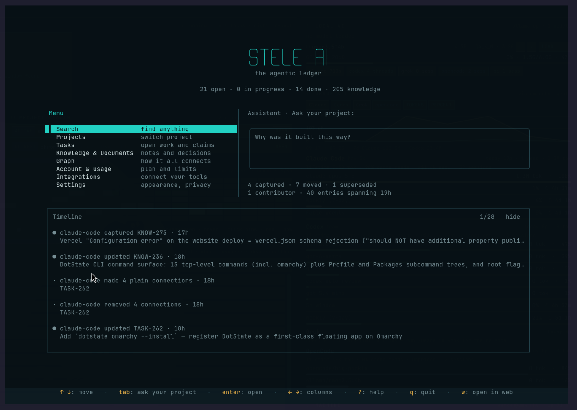
That redesign is an important part of the process. A comparison prototype should hold enough constant to reveal a tradeoff. It need not become the product's permanent information architecture. We kept the successful interaction foundation and discarded the comparison layout when a broader set of screens made its limits obvious.
Today the terminal client can open tasks, knowledge and documents, search, show graph views, manage integrations, display account usage, and talk to Wisp. Those features arrived through many small slices after the renderer choice. The decisive September experiment did something narrower: it let us feel the interaction, measure the executable cost, and inspect who would be responsible for the difficult terminal behavior as the interface grew.
If you are making the same choice, start with the interactions that will compound: a long scrolling view, a text input, a modal, a resize, and pointer input on the same screen. Give both implementations the same data and controls. Measure the executable you will actually distribute. Then read the code after using the prototypes. The interesting result is not which one draws the first screen. It is which one leaves you with a system you can still change after the tenth screen arrives.